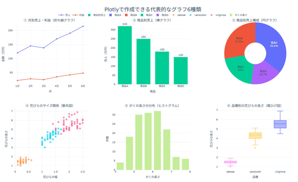

みなさん、こんにちは。日々、データの可視化に頭を悩ませていませんか?「静止画のグラフだけでは、データの細かいニュアンスが伝わりにくい…」と感じることもあるかと思います。 今回は、そんな悩みを解決してくれる強力なライブラリ「Plotly(プロットリー)」をご紹介します。Plotlyを使えば、まるで見せるプレゼンテーションのように、Webブラウザ上で自由に動かせる美しいグラフが、驚くほど簡単に作成できます。データの奥に隠れたストーリーを、一緒に解き明かしてみましょう。
Plotlyとは?
Plotlyは、Pythonをはじめ、RやJavaScriptなど複数の言語で利用されている高機能なグラフ描画ライブラリです。
最大の特徴は、出力されるグラフが「インタラクティブ(双方向的)」である点です。描画されたグラフ上でマウスカーソルを動かすと、データの詳細(ホバー表示)を確認できたり、特定のエリアをズームインしたり、凡例をクリックして特定のデータ列を非表示にしたりすることができます。
Plotlyを使うと、まるでWebアプリケーションを作っているようなワクワク感が得られますよ。ダッシュボード作成にも応用できるんです!
Plotlyを利用するメリット
- 直感的で動的な操作性
静的な画像とは異なり、読者自身がグラフを操作してデータを多角的に分析できます。ズーム、パン、自動スケーリングなどの操作が標準で備わっています。 - Plotly Expressによる圧倒的な書きやすさ
かつては複雑なコードが必要でしたが、高水準ラッパーであるplotly.express(通称: Px)の登場により、pandasのDataFrameを渡すだけで、わずか1行から洗練されたグラフを描画できるようになりました。 - HTML形式での簡単な共有
作成したグラフは、そのままインタラクティブな機能を保持したHTMLファイルとして保存できます。Webサイトに埋め込んだり、メールに添付して共有したりするのも容易です。
Plotlyの基本的な使い方
まずは、代表的な plotly.express を使って、散布図を作成してみましょう。
pip install "plotly[express]" pandasimport plotly.express as px
# サンプルのアヤメ(iris)データを読み込みます
df = px.data.iris()
# 散布図を作成します
fig = px.scatter(
df,
x="sepal_width",
y="sepal_length",
color="species",
size="petal_length",
hover_data=['petal_width'],
title="アヤメのサイズ分析(インタラクティブ散布図)"
)
# グラフをブラウザに表示します
fig.show()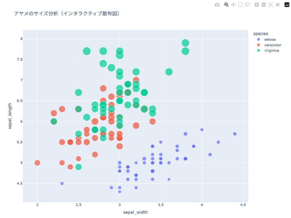
ブラウザ上でマウスを動かすと、データの詳細がポップアップ表示されます。凡例の「setosa」をクリックすると、そのデータだけを一時的に非表示にすることもできるんですよ。
このコードを実行すると、自動的にWebブラウザが立ち上がり、カラフルで美しい散布図が表示されます。各点にマウスを当てると、詳細な数値が表示され、右上のメニューを使って拡大や画像の保存も行えます。
みーちゃんのワンポイント
PlotlyのグラフをJupyter NotebookやGoogle Colab以外で実行する際、fig.show() を使うとブラウザが開きますが、Webページに組み込みたい時は fig.write_html("output.html") を使いましょう。これで1枚のHTMLファイルとして書き出され、誰にでも動くグラフを簡単に共有できますよ。
おまけ
import pandas as pd
import plotly.express as px
import plotly.graph_objects as go
from plotly.subplots import make_subplots


# =========================================================
# サンプルデータ
# =========================================================

# 月別売上データ
sales_df = pd.DataFrame({
    "月": ["1月", "2月", "3月", "4月", "5月", "6月"],
    "売上": [120, 145, 138, 170, 190, 215],
    "利益": [22, 28, 25, 35, 42, 48]
})

# 商品別売上データ
product_df = pd.DataFrame({
    "商品": ["商品A", "商品B", "商品C", "商品D"],
    "売上": [320, 250, 180, 150]
})

# Plotlyに用意されているアヤメデータ
iris_df = px.data.iris()


# =========================================================
# 2行×3列のグラフ領域を作成
# =========================================================

fig = make_subplots(
    rows=2,
    cols=3,
    subplot_titles=(
        "① 月別売上・利益(折れ線グラフ)",
        "② 商品別売上(棒グラフ)",
        "③ 商品別売上構成(円グラフ)",
        "④ 花びらのサイズ関係(散布図)",
        "⑤ がくの長さの分布(ヒストグラム)",
        "⑥ 品種別の花びらの長さ(箱ひげ図)"
    ),
    specs=[
        [
            {"type": "xy"},
            {"type": "xy"},
            {"type": "domain"}
        ],
        [
            {"type": "xy"},
            {"type": "xy"},
            {"type": "xy"}
        ]
    ],
    horizontal_spacing=0.10,
    vertical_spacing=0.16
)


# =========================================================
# ① 折れ線グラフ
# =========================================================

fig.add_trace(
    go.Scatter(
        x=sales_df["月"],
        y=sales_df["売上"],
        mode="lines+markers",
        name="売上",
        hovertemplate="%{x}<br>売上:%{y}万円<extra></extra>"
    ),
    row=1,
    col=1
)

fig.add_trace(
    go.Scatter(
        x=sales_df["月"],
        y=sales_df["利益"],
        mode="lines+markers",
        name="利益",
        hovertemplate="%{x}<br>利益:%{y}万円<extra></extra>"
    ),
    row=1,
    col=1
)


# =========================================================
# ② 棒グラフ
# =========================================================

fig.add_trace(
    go.Bar(
        x=product_df["商品"],
        y=product_df["売上"],
        name="商品別売上",
        text=product_df["売上"],
        textposition="outside",
        hovertemplate="%{x}<br>売上:%{y}万円<extra></extra>"
    ),
    row=1,
    col=2
)


# =========================================================
# ③ 円グラフ
# =========================================================

fig.add_trace(
    go.Pie(
        labels=product_df["商品"],
        values=product_df["売上"],
        name="売上構成",
        hole=0.35,
        textinfo="label+percent",
        hovertemplate="%{label}<br>売上:%{value}万円<br>構成比:%{percent}<extra></extra>"
    ),
    row=1,
    col=3
)


# =========================================================
# ④ 散布図
# =========================================================

species_names = iris_df["species"].unique()

for species in species_names:
    species_df = iris_df[iris_df["species"] == species]

    fig.add_trace(
        go.Scatter(
            x=species_df["petal_width"],
            y=species_df["petal_length"],
            mode="markers",
            name=species,
            legendgroup=species,
            marker={
                "size": 9,
                "opacity": 0.75
            },
            hovertemplate=(
                f"品種:{species}<br>"
                "花びらの幅:%{x}<br>"
                "花びらの長さ:%{y}"
                "<extra></extra>"
            )
        ),
        row=2,
        col=1
    )


# =========================================================
# ⑤ ヒストグラム
# =========================================================

fig.add_trace(
    go.Histogram(
        x=iris_df["sepal_length"],
        name="がくの長さ",
        nbinsx=15,
        opacity=0.8,
        hovertemplate=(
            "がくの長さ:%{x}<br>"
            "件数:%{y}"
            "<extra></extra>"
        )
    ),
    row=2,
    col=2
)


# =========================================================
# ⑥ 箱ひげ図
# =========================================================

for species in species_names:
    species_df = iris_df[iris_df["species"] == species]

    fig.add_trace(
        go.Box(
            x=[species] * len(species_df),
            y=species_df["petal_length"],
            name=f"{species} 箱ひげ",
            legendgroup=species,
            showlegend=False,
            boxpoints="outliers",
            hovertemplate=(
                f"品種:{species}<br>"
                "花びらの長さ:%{y}"
                "<extra></extra>"
            )
        ),
        row=2,
        col=3
    )


# =========================================================
# 軸ラベル
# =========================================================

fig.update_xaxes(title_text="月", row=1, col=1)
fig.update_yaxes(title_text="金額(万円)", row=1, col=1)

fig.update_xaxes(title_text="商品", row=1, col=2)
fig.update_yaxes(title_text="売上(万円)", row=1, col=2)

fig.update_xaxes(title_text="花びらの幅", row=2, col=1)
fig.update_yaxes(title_text="花びらの長さ", row=2, col=1)

fig.update_xaxes(title_text="がくの長さ", row=2, col=2)
fig.update_yaxes(title_text="件数", row=2, col=2)

fig.update_xaxes(title_text="品種", row=2, col=3)
fig.update_yaxes(title_text="花びらの長さ", row=2, col=3)


# =========================================================
# 全体デザイン
# =========================================================

fig.update_layout(
    title={
        "text": "Plotlyで作成できる代表的なグラフ6種類",
        "x": 0.5,
        "xanchor": "center",
        "font": {
            "size": 26
        }
    },
    template="plotly_white",
    height=900,
    width=1500,
    margin={
        "l": 60,
        "r": 60,
        "t": 110,
        "b": 60
    },
    legend={
        "orientation": "h",
        "yanchor": "bottom",
        "y": 1.03,
        "xanchor": "center",
        "x": 0.5
    },
    hoverlabel={
        "font_size": 14
    },
    bargap=0.25
)


# サブタイトルの文字サイズ
for annotation in fig.layout.annotations:
    annotation.font.size = 16


# =========================================================
# ブラウザに表示
# =========================================================

fig.show()


# HTMLファイルとして保存する場合
# fig.write_html("plotly_graph_samples.html")