

こんにちは。皆さんは、データの分析結果を社内やチームに共有する際、どのようにプレゼンテーションしていますか?Excelのグラフや静的なレポートも素敵ですが、ユーザーが自由に条件を変更して探索できる「動的なWeb画面」があると、より深い洞察が得られますよね。今回は、Pythonだけでリッチな分析ダッシュボードや業務Webアプリを構築できる強力なライブラリ「Dash」をご紹介します。フロントエンドの専門知識がなくても、データサイエンスの成果をそのまま美しいWebアプリへと昇華させることができます。
Dashとは?
Dashは、データ視覚化ライブラリであるPlotly社によって開発された、データ分析に特化したWebアプリケーションフレームワークです。Flask、Plotly.js、そしてReact.jsをベースに構築されていますが、開発者はそれらの複雑な仕組みを意識することなく、PythonコードのみでインタラクティブなWeb画面を作り上げることができます。
Dashを導入するメリット
- Pythonだけで完結するフルスタック開発
HTML、CSS、JavaScriptなどのWebフロントエンド言語を一切書くことなく、コンポーネントを配置していくだけでモダンなUI(ユーザーインターフェース)が完成します。 - 直感的かつ高度なインタラクティブ性
ドロップダウンの選択やスライダーの移動、グラフ上のクリックといったユーザーの操作に応じて、リアルタイムに表示データを変更・再描画する「コールバック(Callback)」機能が極めて直感的で強力です。
HTMLやJavaScriptを個別に勉強しなくても、Pythonのロジックだけで高機能な画面が構築できるのは本当に魅力的ですよね。
- 豊富なビジュアライゼーション
Plotlyの表現力豊かなグラフをそのまま埋め込むことができるため、3Dプロット、地図データ、金融チャートなど、あらゆるデータの可視化に対応できます。
実装サンプル:動的な棒グラフの作成
グラフが動的に変化するダッシュボードのコード例です。
ローカル環境で実行するだけで、ローカルサーバーが立ち上がり、ブラウザ上で動くダッシュボードがすぐに完成します!
pip install dash plotly pandasimport random
import dash
from dash import Input, Output, dash_table, dcc, html
import pandas as pd
import plotly.express as px
# =========================================================
# サンプルデータの作成
# =========================================================
random.seed(42)
regions = ["東日本", "西日本", "中部", "九州"]
products = ["ノートPC", "モニター", "周辺機器", "ソフトウェア"]
years = [2024, 2025, 2026]
base_sales = {
"ノートPC": 1_500_000,
"モニター": 900_000,
"周辺機器": 550_000,
"ソフトウェア": 700_000,
}
region_rate = {
"東日本": 1.25,
"西日本": 1.10,
"中部": 0.95,
"九州": 0.80,
}
records = []
for year in years:
year_rate = 1 + ((year - 2024) * 0.08)
for month in range(1, 13):
# 年末に売上が伸びるような季節変動
seasonal_rate = 1 + (month - 6) * 0.015
for region in regions:
for product in products:
variation = random.uniform(0.80, 1.20)
sales = int(
base_sales[product]
* region_rate[region]
* year_rate
* seasonal_rate
* variation
)
profit_rate = random.uniform(0.15, 0.28)
profit = int(sales * profit_rate)
average_order_price = {
"ノートPC": 150_000,
"モニター": 55_000,
"周辺機器": 18_000,
"ソフトウェア": 70_000,
}[product]
orders = max(
1,
int(
sales
/ average_order_price
* random.uniform(0.85, 1.15)
),
)
records.append(
{
"Year": year,
"Month": month,
"Date": pd.Timestamp(year=year, month=month, day=1),
"Region": region,
"Product": product,
"Sales": sales,
"Profit": profit,
"Orders": orders,
}
)
df = pd.DataFrame(records)
df["MonthLabel"] = df["Date"].dt.strftime("%Y年%m月")
# =========================================================
# Dashアプリの初期化
# =========================================================
app = dash.Dash(__name__)
app.title = "営業売上ダッシュボード"
# =========================================================
# 共通スタイル
# =========================================================
PAGE_STYLE = {
"backgroundColor": "#f4f7fb",
"minHeight": "100vh",
"padding": "28px",
"fontFamily": (
"'Yu Gothic UI', 'Meiryo', "
"'Hiragino Kaku Gothic ProN', sans-serif"
),
}
CARD_STYLE = {
"backgroundColor": "#ffffff",
"borderRadius": "14px",
"padding": "20px",
"boxShadow": "0 4px 16px rgba(0, 0, 0, 0.06)",
"border": "1px solid #e8edf5",
}
KPI_CARD_STYLE = {
**CARD_STYLE,
"flex": "1",
"minWidth": "210px",
}
KPI_LABEL_STYLE = {
"fontSize": "14px",
"color": "#6b7280",
"marginBottom": "8px",
}
KPI_VALUE_STYLE = {
"fontSize": "30px",
"fontWeight": "bold",
"color": "#1f2937",
"margin": "0",
}
# =========================================================
# レイアウト
# =========================================================
app.layout = html.Div(
style=PAGE_STYLE,
children=[
# ヘッダー
html.Div(
[
html.H1(
"営業売上ダッシュボード",
style={
"margin": "0",
"fontSize": "32px",
"color": "#1f2937",
},
),
html.P(
"地域・商品カテゴリ・年度ごとの売上状況を確認できます。",
style={
"marginTop": "8px",
"marginBottom": "0",
"color": "#6b7280",
},
),
],
style={"marginBottom": "24px"},
),
# フィルター
html.Div(
style={
**CARD_STYLE,
"marginBottom": "22px",
},
children=[
html.Div(
[
html.Div(
[
html.Label(
"年度",
style={
"display": "block",
"fontWeight": "bold",
"marginBottom": "8px",
"color": "#374151",
},
),
dcc.Dropdown(
id="year-dropdown",
options=[
{"label": f"{year}年", "value": year}
for year in years
],
value=2026,
clearable=False,
),
],
style={
"flex": "1",
"minWidth": "180px",
},
),
html.Div(
[
html.Label(
"地域",
style={
"display": "block",
"fontWeight": "bold",
"marginBottom": "8px",
"color": "#374151",
},
),
dcc.Dropdown(
id="region-dropdown",
options=[
{"label": region, "value": region}
for region in regions
],
value=regions,
multi=True,
placeholder="地域を選択",
),
],
style={
"flex": "2",
"minWidth": "260px",
},
),
html.Div(
[
html.Label(
"商品カテゴリ",
style={
"display": "block",
"fontWeight": "bold",
"marginBottom": "8px",
"color": "#374151",
},
),
dcc.Dropdown(
id="product-dropdown",
options=[
{
"label": product,
"value": product,
}
for product in products
],
value=products,
multi=True,
placeholder="商品カテゴリを選択",
),
],
style={
"flex": "2",
"minWidth": "260px",
},
),
],
style={
"display": "flex",
"gap": "18px",
"flexWrap": "wrap",
},
)
],
),
# KPIカード
html.Div(
[
html.Div(
[
html.Div("総売上", style=KPI_LABEL_STYLE),
html.P(id="sales-kpi", style=KPI_VALUE_STYLE),
],
style=KPI_CARD_STYLE,
),
html.Div(
[
html.Div("総利益", style=KPI_LABEL_STYLE),
html.P(id="profit-kpi", style=KPI_VALUE_STYLE),
],
style=KPI_CARD_STYLE,
),
html.Div(
[
html.Div("受注件数", style=KPI_LABEL_STYLE),
html.P(id="orders-kpi", style=KPI_VALUE_STYLE),
],
style=KPI_CARD_STYLE,
),
html.Div(
[
html.Div("利益率", style=KPI_LABEL_STYLE),
html.P(id="margin-kpi", style=KPI_VALUE_STYLE),
],
style=KPI_CARD_STYLE,
),
],
style={
"display": "flex",
"gap": "18px",
"flexWrap": "wrap",
"marginBottom": "22px",
},
),
# 上段グラフ
html.Div(
[
html.Div(
dcc.Graph(
id="sales-line-chart",
config={"displayModeBar": False},
),
style={
**CARD_STYLE,
"flex": "2",
"minWidth": "520px",
},
),
html.Div(
dcc.Graph(
id="region-pie-chart",
config={"displayModeBar": False},
),
style={
**CARD_STYLE,
"flex": "1",
"minWidth": "360px",
},
),
],
style={
"display": "flex",
"gap": "18px",
"flexWrap": "wrap",
"marginBottom": "22px",
},
),
# 商品別グラフ
html.Div(
dcc.Graph(
id="product-bar-chart",
config={"displayModeBar": False},
),
style={
**CARD_STYLE,
"marginBottom": "22px",
},
),
# データテーブル
html.Div(
[
html.H2(
"月別・地域別データ",
style={
"fontSize": "20px",
"color": "#1f2937",
"marginTop": "0",
},
),
dash_table.DataTable(
id="sales-table",
columns=[
{"name": "年月", "id": "MonthLabel"},
{"name": "地域", "id": "Region"},
{"name": "商品", "id": "Product"},
{
"name": "売上",
"id": "Sales",
"type": "numeric",
"format": {
"specifier": ",",
"locale": {
"symbol": ["¥", ""],
},
},
},
{
"name": "利益",
"id": "Profit",
"type": "numeric",
"format": {
"specifier": ",",
"locale": {
"symbol": ["¥", ""],
},
},
},
{
"name": "受注件数",
"id": "Orders",
"type": "numeric",
"format": {"specifier": ","},
},
],
page_size=12,
sort_action="native",
filter_action="native",
style_table={
"overflowX": "auto",
"borderRadius": "10px",
},
style_header={
"backgroundColor": "#eef2f7",
"fontWeight": "bold",
"color": "#374151",
"border": "none",
"padding": "12px",
},
style_cell={
"fontFamily": "'Yu Gothic UI', 'Meiryo', sans-serif",
"textAlign": "left",
"padding": "11px",
"border": "none",
"borderBottom": "1px solid #edf0f4",
"color": "#374151",
"backgroundColor": "#ffffff",
},
style_data_conditional=[
{
"if": {"row_index": "odd"},
"backgroundColor": "#fafbfc",
},
{
"if": {"column_id": ["Sales", "Profit", "Orders"]},
"textAlign": "right",
},
],
),
],
style=CARD_STYLE,
),
],
)
# =========================================================
# コールバック
# =========================================================
@app.callback(
Output("sales-kpi", "children"),
Output("profit-kpi", "children"),
Output("orders-kpi", "children"),
Output("margin-kpi", "children"),
Output("sales-line-chart", "figure"),
Output("region-pie-chart", "figure"),
Output("product-bar-chart", "figure"),
Output("sales-table", "data"),
Input("year-dropdown", "value"),
Input("region-dropdown", "value"),
Input("product-dropdown", "value"),
)
def update_dashboard(selected_year, selected_regions, selected_products):
# 未選択の場合でもエラーにしない
selected_regions = selected_regions or []
selected_products = selected_products or []
filtered_df = df[
(df["Year"] == selected_year)
& (df["Region"].isin(selected_regions))
& (df["Product"].isin(selected_products))
].copy()
total_sales = filtered_df["Sales"].sum()
total_profit = filtered_df["Profit"].sum()
total_orders = filtered_df["Orders"].sum()
profit_margin = (
total_profit / total_sales * 100
if total_sales > 0
else 0
)
sales_kpi = f"¥{total_sales:,.0f}"
profit_kpi = f"¥{total_profit:,.0f}"
orders_kpi = f"{total_orders:,.0f}件"
margin_kpi = f"{profit_margin:.1f}%"
# 月別売上推移
monthly_df = (
filtered_df.groupby(["Month", "MonthLabel"], as_index=False)
.agg(
Sales=("Sales", "sum"),
Profit=("Profit", "sum"),
)
.sort_values("Month")
)
line_fig = px.line(
monthly_df,
x="MonthLabel",
y=["Sales", "Profit"],
markers=True,
title="月別 売上・利益推移",
labels={
"MonthLabel": "",
"value": "金額",
"variable": "項目",
},
)
line_fig.update_layout(
template="plotly_white",
legend_title_text="",
hovermode="x unified",
margin={"l": 40, "r": 20, "t": 60, "b": 40},
yaxis_tickprefix="¥",
yaxis_tickformat=",",
plot_bgcolor="#ffffff",
paper_bgcolor="#ffffff",
)
line_fig.for_each_trace(
lambda trace: trace.update(
name={
"Sales": "売上",
"Profit": "利益",
}.get(trace.name, trace.name)
)
)
# 地域別売上構成
region_df = (
filtered_df.groupby("Region", as_index=False)
.agg(Sales=("Sales", "sum"))
.sort_values("Sales", ascending=False)
)
pie_fig = px.pie(
region_df,
names="Region",
values="Sales",
hole=0.52,
title="地域別 売上構成",
)
pie_fig.update_traces(
textposition="inside",
textinfo="percent+label",
hovertemplate=(
"%{label}<br>"
"売上: ¥%{value:,.0f}<br>"
"構成比: %{percent}"
"<extra></extra>"
),
)
pie_fig.update_layout(
template="plotly_white",
showlegend=False,
margin={"l": 20, "r": 20, "t": 60, "b": 20},
paper_bgcolor="#ffffff",
)
# 商品別売上・利益
product_df = (
filtered_df.groupby("Product", as_index=False)
.agg(
Sales=("Sales", "sum"),
Profit=("Profit", "sum"),
)
.sort_values("Sales", ascending=False)
)
bar_fig = px.bar(
product_df,
x="Product",
y=["Sales", "Profit"],
barmode="group",
title="商品カテゴリ別 売上・利益",
labels={
"Product": "",
"value": "金額",
"variable": "項目",
},
)
bar_fig.update_layout(
template="plotly_white",
legend_title_text="",
margin={"l": 40, "r": 20, "t": 60, "b": 40},
yaxis_tickprefix="¥",
yaxis_tickformat=",",
plot_bgcolor="#ffffff",
paper_bgcolor="#ffffff",
)
bar_fig.for_each_trace(
lambda trace: trace.update(
name={
"Sales": "売上",
"Profit": "利益",
}.get(trace.name, trace.name)
)
)
# テーブル表示用データ
table_df = filtered_df[
[
"Date",
"MonthLabel",
"Region",
"Product",
"Sales",
"Profit",
"Orders",
]
].sort_values(
["Date", "Region", "Product"],
ascending=[False, True, True],
)
table_data = table_df.drop(columns=["Date"]).to_dict("records")
return (
sales_kpi,
profit_kpi,
orders_kpi,
margin_kpi,
line_fig,
pie_fig,
bar_fig,
table_data,
)
# =========================================================
# サーバー起動
# =========================================================
if __name__ == "__main__":
app.run(debug=True)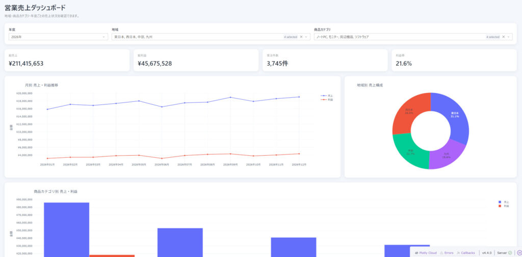
みーちゃんのワンポイント
Dashを使う上で最も重要なのは「状態(State)とコールバック(Callback)の設計」です。複数の入力が複雑に絡み合うとアプリの挙動が重くなったり、意図しない無限ループが発生したりすることがあります。最初に入力と出力の依存関係をシンプルに整理してから実装を始めることが、美しく軽快なアプリを仕上げる最大のコツですよ。